top of page

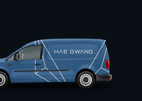
HAE GWANG
Logo Design
2015
Hae Gwang is an information and communications technology company from Gwang-Ju in South Korea. The company focuses on working to unify communications and the integration of telecommunications (telephone lines and wireless signals).
The word ‘Hae’ means sun and ‘Gwang’ means light which describes electricity. The client wanted to identity to communicate. It led to the creation of a triangle shape logo that explains ‘information network’.
The colours are displayed using two complementary orange (three different shades of orange give a warm, bright, and sunlight appearance) and blue (three different shades of blue gives intelligence, trust, and communication meanings).


bottom of page