top of page
SC
Logo Design
2021
This is a personal logo design project. I designed a basic brand identity for Seol Cheon who is a web developer based in Canada.
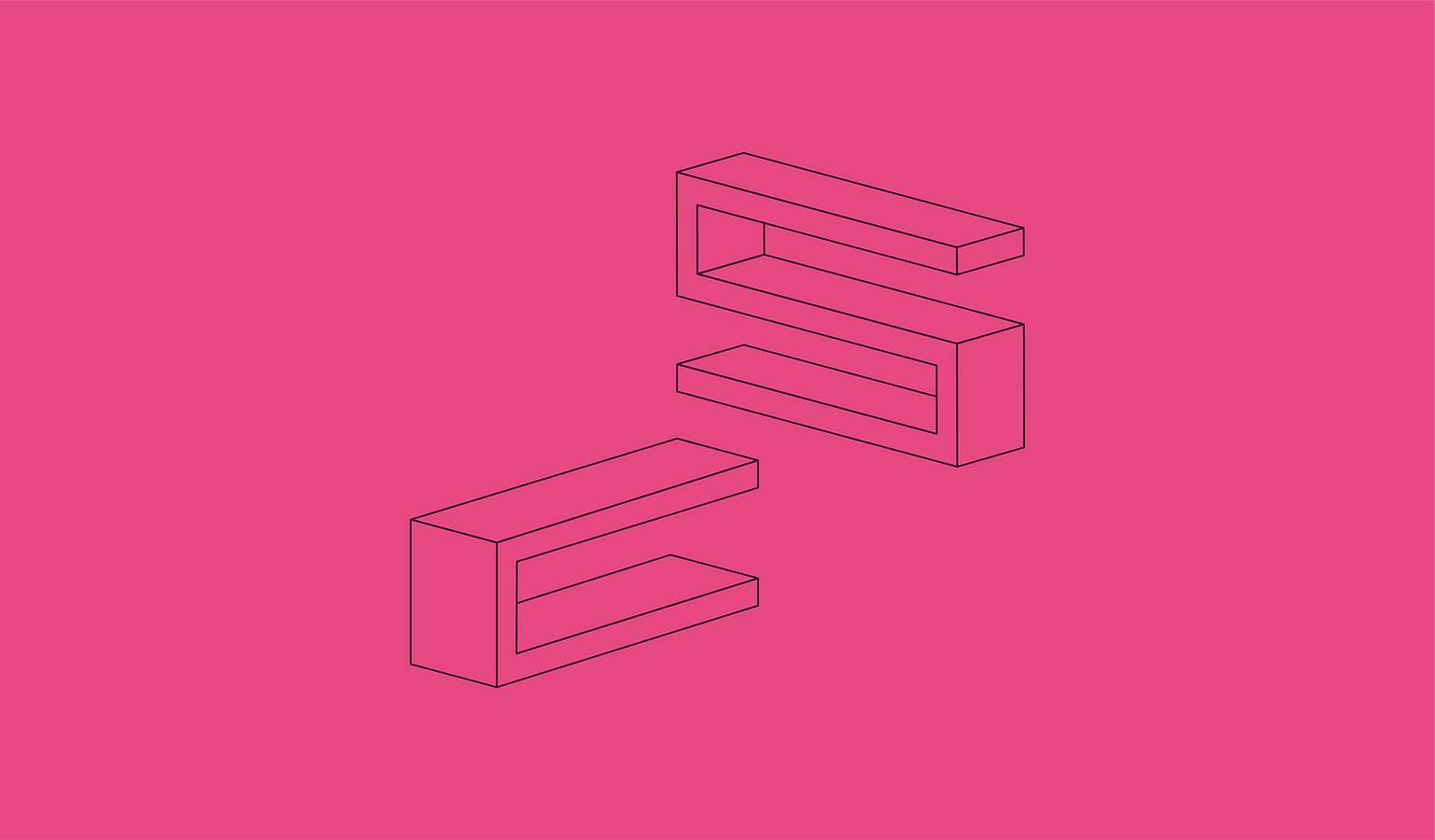
The design process started with her ideas. She required the logo shape to be made from the two letters of her name and the pink colour palette.
I played 3D geometric shapes of ’S, C’. Because a web developer is a programmer who is engaged in the development of World Wide Web applications. I would like to describe the creativity and technical knowledge through the logo. The final logo shape has a visual metaphor ‘stairs’ which has the meaning 'Achieving a goal'.


bottom of page